Beginner’s Guide to Plotting Data with Python and Matplotlib
Data visualization is a powerful tool for gaining insights, identifying patterns, and communicating findings. Python, with its extensive libraries, offers an excellent platform for creating compelling visualizations. In this tutorial, we’ll dive into the world of data plotting using the popular library Matplotlib. Whether you’re a beginner or looking to enhance your plotting skills, this guide will walk you through the process step by step.
Introduction to Matplotlib
Matplotlib is a widely-used data visualization library in Python. It provides a versatile and user-friendly interface for creating a wide range of plots and charts, from simple line plots to complex 3D visualizations.
Installing Matplotlib
Before you start plotting data, you need to make sure Matplotlib is installed. You can install it using pip, the Python package manager:
pip install matplotlibBasic Line Plot
Let’s start with a simple line plot to visualize a dataset. Consider the following example:
import matplotlib.pyplot as plt

# Sample data
x = [1, 2, 3, 4, 5]
y = [3, 7, 2, 8, 5]

# Create a line plot
plt.plot(x, y)

# Display the plot
plt.show()
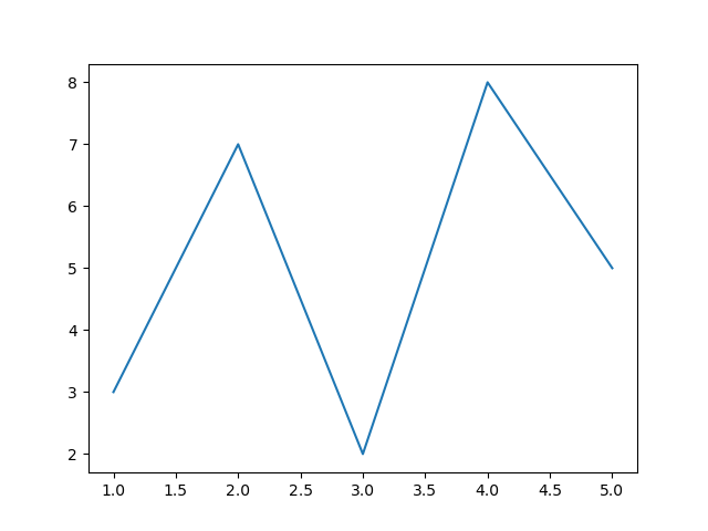
This code will generate a basic line plot showing the relationship between x and y values.
Customizing Plots
Changing Line Colors and Styles
You can customize the appearance of your plot by changing line colors and styles. For example:
plt.plot(x, y, color='red', linestyle='--', marker='o', label='Data')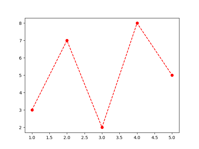
Adding Titles and Labels
To make your plot more informative, add titles and labels:
plt.title('Sample Line Plot')
plt.xlabel('X-axis Label')
plt.ylabel('Y-axis Label')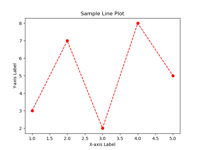
Setting Axis Limits
Adjust the axis limits to focus on specific data ranges:
plt.xlim(0, 6)
plt.ylim(0, 10)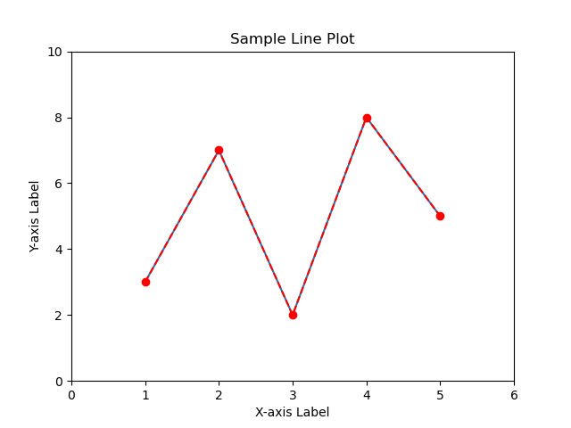
Multiple Plots in One Figure
You can create multiple plots in a single figure using subplots:
plt.subplot(2, 1, 1)  # 2 rows, 1 column, first plot
plt.plot(x, y)

plt.subplot(2, 1, 2)  # 2 rows, 1 column, second plot
plt.scatter(x, y, color='red', marker='x')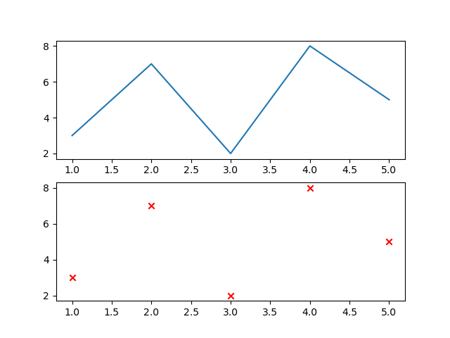
Scatter Plots
Scatter plots are useful for visualizing the relationship between two variables. Here’s an example:
plt.scatter(x, y, color='blue', marker='o', label='Data Points')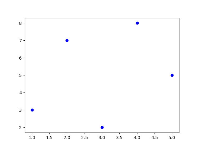
Bar Plots
Bar plots are great for comparing categorical data:
categories = ['A', 'B', 'C', 'D', 'E']
values = [25, 18, 32, 15, 10]

plt.bar(categories, values, color='green')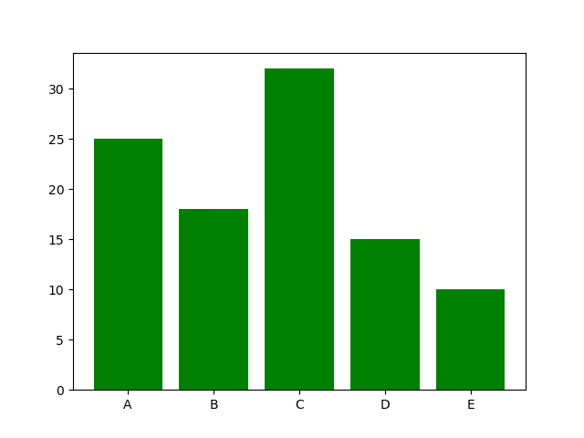
Histograms
Histograms help visualize the distribution of data:
data = [2, 2, 3, 3, 3, 4, 4, 4, 4, 5, 5, 6, 6, 6, 6, 6, 7, 7, 8, 8]

plt.hist(data, bins=5, color='purple', edgecolor='black')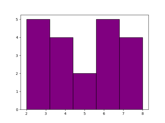
Saving and Exporting Plots
You can save your plots as image files:
plt.savefig('plot.png', dpi=300, bbox_inches='tight')Conclusion
Matplotlib is an essential tool for data visualization in Python. This tutorial covered the basics of creating various types of plots and customizing their appearance. Experiment with different plot types and customization options to effectively communicate your data’s insights. With practice, you’ll be able to create visually appealing and informative plots to enhance your data analysis projects. Happy plotting!
References
- Matplotlib Documentation: The official documentation provides comprehensive information on Matplotlib’s capabilities, functions, and usage. It includes tutorials, examples, and detailed explanations.
- Matplotlib Tutorials: This section of the official documentation offers a collection of tutorials covering various aspects of Matplotlib, from basic plotting to advanced techniques.
- Data Visualization with Matplotlib on Real Python: Real Python offers a series of tutorials focused on data visualization using Matplotlib. These tutorials provide practical examples and explanations.
- Matplotlib Cheat Sheet: This cheat sheet provides a quick reference guide for Matplotlib’s syntax and common tasks. It’s a handy resource to have while working on your plots.
This tutorial uses Python 3.10.12 and Matplotlib 3.5.1.


